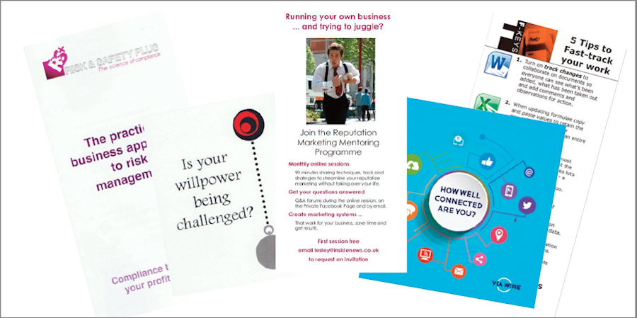
Everything is digital these days – but then you have to go to a live event and have nothing except your business cards to promote your business. It’s time to create a flyer.
Before you call up your designer or open Photoshop, think about what you want to achieve and the best way to do that.
What’s the message?
I go to a lot of networking events and pick up lots of flyers covered with information, many with no clear message. They just seem to be general information leaflets – with a ‘this is everything we do’ type of message. Most of them go into the recycling bin!
If you’re going to invest in a flyer what do you want people to do when they read it? What needs to be included in the message to increase the chance of them doing that?
Invest time in creating a great headline
Your headline should get attention and all the great copywriters emphasise that you should spend 80% of your writing time in crafting a really good headline. To do this you need to know your target audience very well – what words will they respond to? You need to get their attention quickly – and get them to want to find out more.
Make sure your headline stands out
Don’t bury your headline in a sea of copy and graphics. White space may be expensive when you have so much to say and only a small area to say it in, but it’s much more expensive to fill it up and lose both the impact and the connection with your reader.
If you’re having a two-sided flyer consider giving one side to your headline with some appropriate graphics – and maybe a one-line introduction that makes people want to turn it over.
Three tips to increase retention
- Paper flyers are really easy to scrunch up and throw away, which is why I recommend that clients think about investing a small amount more and having your flyer on card.
- What size should it be? One of the most effective sizes is a tall card that is one-third of an A4 page. Some people use the whole A4 sheet and fold it into three to make a small trifold brochure. This size fits in most bags and the inside pocket of a jacket too. It’s also easy to pop into a standard envelope. Postcard size works too, but A5 can be just that bit too big to fit anywhere.
- Have information that is of value. Five tips, three steps, a 10 point checklist. This ensures that it stays around people’s desks for longer as there’s useful information on it.
One word of warning – don’t DIY (unless you’ve studied graphic design)! Get a designer to put it together, it will look so much more professional.

