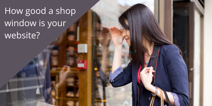
If you have an eCommerce website your website isn’t just your shop window – it’s your shop too. But if you have what is often referred to as a ‘brochure site’, it’s intended to be a taster for people to get a feel for what you offer.
This means that your home page is, effectively, your shop window. It’s the equivalent of someone staring in from the pavement to see if there’s anything to take their fancy.
Don’t waste prime real estate
Make every centimetre count.
Starting at the top:
Your brand banner: Ensure your logo is clear and add your phone/email on the right so people can easily contact you.
Your banner: the image must be relevant to your business, it’s not eye-candy!
Your opening headline: make sure there is a strong headline on the first screen so people don’t have to scroll to find out what’s on offer. A great headline that is focused on your ideal client will capture their interest and encourage them to read on.
Your introduction: this needs to be short – around 100 words to introduce how you help your clients/customers. Ideally it should also have a headline to lead people into it.
Your core products or services: these need to be displayed as clickable boxes or images so people can go straight to what takes their interest. This might be a row of three or, if you have more a matrix arrangement with two rows of two or three. There really shouldn’t be more than six or people will have too many things to choose from.
About your company: A thumbnail of your About page with a clickthrough direct to the longer version, gives people an idea of who they’re dealing with and maybe an indication of your values and standards.
Testimonials: This can be a couple of carefully chosen quotes from happy customers or a scrolling marquee with several testimonials featured. If the latter ensure that the speed that the quotes scroll at is slow enough for people to read the whole testimonial.
Blogs: If you have a blog on your website (and you should for all kinds of reasons) have the last three titles/images showing up on the home page so people can see the kind of knowledge you have.
Your footer: Typically this will include a repeat of your menu/navigation, your social media links and perhaps your contact information.
If you get all these on target your website will be a good shop window that gives people enough information to want to know more. The aim is to get them to get in touch, not to sell them on your site.
